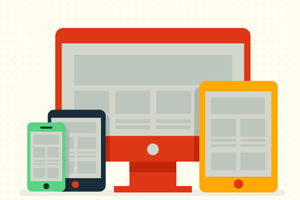
Due to the radical change of thinking that is required, responsive web design can be confusing at first. To understand what responsive design is, you will need to first understand the problem it solves. It is quite obvious that computers are not the only piece of technology that use a web browser. Currently, mobile devices such as smart-phones and tablets are becoming more popular.
The changing landscape of internet browsers means that users’ expectations are also changing. People expect to browse on their mobile devices as easily as they do on a laptop or desktop computer. The web design community began creating mobile versions of their websites in a bid to respond to people’s needs. In hindsight, it was not the solution, but at the time it was seen to be a reasonable idea. Each website would have a bonus ‘mobile’ version of the normal desktop version of their site.
Technology is constantly marching on, so shortly after the mobile device market had been revolutionized, other factors gained popularity. Devices such as netbooks (small notebook computers) started appearing everywhere. Apart from small screens, high-resolution, large displays are starting to become more common than they used to be in the past. It would be unreasonable for web designers not to take advantage of such changes.
Simply put, the spectrum of resolutions and screen sizes is widening almost on a daily basis. Thus creation of different versions of websites to suit the needs of each device is not a practical way forward. This is the issue that is addressed head on by responsive website design. Basically responsive web design is a collection of ideas and techniques. Now that you have an understanding of the problem that is being addressed, you can have a look at every part of the solution.
Fluid Grids
The usage of something known as a fluid grid is the first key idea behind responsive design. Just recently, creating fixed layouts was more popular than creating a ‘liquid layout’ that expands with the page. Fixed width layouts can be described as page designs that have a fixed number of pixels centered on the page after they have gone across. However, when you consider the large number of screens present in today’s market, the advantage of liquid layouts is too big to ignore.
Fluid grids move several steps beyond the traditionally known liquid layout. Instead of the layout being designed on arbitrary percentage of rigid pixels values, a fluid grid is designed more carefully in terms of proportions. This way, when a layout is stretched across a huge screen or squeezed onto a tiny mobile device, all elements within the layout will automatically resize their widths in relation to each other.
As much as they are not perfect, fluid grids are a very crucial part of creating a responsive design. The design can start to severely break down when the browser’s width becomes too narrow. For instance, a small mobile phone will not be able to handle a complex three-column layout. Fortunately, media queries are used by responsive design to take care of this problem.
Media Queries
CSS3 media queries is the second part of responsive design. They are currently enjoying a substantial amount of support from many modern browsers. If you have never heard about media queries, they basically help you apply CSS styles by allowing you to gather data about the site visitor.
In an ideal world, you would have to ensure your layout is adjusted to match every device width perfectly. Often you have to choose and pick where you spend your efforts. In a perspective that is more practical, the resolutions that is targeted by a design will be based on the resolutions that are being used by people using the said design, highly contextual situations, budget constraints, time and so on.
In summary when you are making decisions on the resolutions you will target, you should use your judgment. Targeting more resolutions means more time spent. Since you do not have unlimited time as you are not immortal, the effort should be carefully spent.
If you want to see how a responsive design works, you can start by opening this article using a desktop browser, and slowly make your browser thinner by resizing it. If all the page elements automatically adjust themselves to fit the new width even as you go all the way to the size of a mobile browser, it means that the page has been designed using responsive design.