
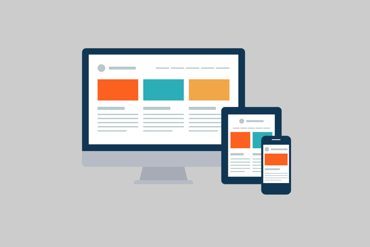
Responsive Web Design isn’t just a new fad. It’s a necessity.
Can you remember the last time you visited a website on your mobile device and it displayed with 1 pt font in a desktop format? Or, perhaps it was a desktop website converted to a mobile responsive design that disproportionately sized elements which left you scrolling down the page past the photos just to read the headline?
Introducing the necessity for Responsive Web Design. With more than half of all users searching on mobile devices, you want your website to display a user-friendly interface and be visually appealing enough to keep readers scrolling through your important information.
Luckily, we’ve compiled 9 Dos and don’ts for you to create a successful Responsive Web Design.
1. Design “Mobile-First”
Build your website in a mobile format first. This will ensure your mobile users see the most important information and their visual experience is not hindered. Then, scale up (if necessary) your desktop website from there.
2. Understand Your Visitors
You must know why your visitors are searching your website. Use free or purchased analytics programs/apps to determine which pages your visitors are landing on, what pages or elements they are spending the most time viewing, and which links they are clicking. Use this information to ensure those items stay easily accessible. If there is something you are intending your viewers to engage with, then these analytics will also provide you that information and you can adjust your content accordingly.
3. Ensure Your Site Loads Quickly
This may mean not actually loading your content in real-time. Our article about Accelerated Mobile Pages (AMP) can break this down for you in more detail. Basically, formatting your website such that the content is already stored on a cloud server will tremendously decrease loading time. Less loading time means less frustrated visitors and more of your content being seen.
4. Use Large Fonts
Your desktop site probably uses around size 14 font. This is too small for mobile users. Some experts on the topic say to size the font you think would work for your mobile users and then increase that by 1 pt. As a rule of thumb, size your <body> text to no less than 16px if you’re still using pixels.
5. Keep User Experience in Mind
Just because you can create all the bells and whistles does not necessarily mean you should. Knowing your visitors will help you determine if they would utilize whatever feature you want to display. If it’s more about your own taste (or ego), then chances are you may want to think twice.
6. Don’t Lose The Point of Your Website
Like we mentioned in #2, the big question to ask is “Why are your visitors coming to your site?” It’s easy to get caught up in the design of a new website. Just remember to ensure your responsive design makes it easy for your visitors to see what you and they want to see.
7. Don’t Hide Content
Sometimes the layout of your website can go wonky when you convert a desktop site to a mobile site. Like we mentioned in #1, it’s better to design “mobile-first”. But, in the case you designed your desktop site first, you’re going to most likely need to resize photos, font, and possibly layout for your mobile site. Though this is time consuming, it is not impossible. Work at it so that you’re not hiding images or content from your visitors as a solution simply because it isn’t displaying correctly.
8. Don’t Clutter Content
A balance between content and white space is a must. You don’t want the reader to be overwhelmed and ultimately lose the message of your content. Likewise, you want the reader to be able to access your content without having to scroll through unnecessary white space. Leave the sidebars and multiple navigation menus out. Simplify your content and visuals, and then simplify again.
9. Don’t Fail To Test
Testing only your coding, though necessary, is not enough. Testing third-party coding/plugins/themes is highly recommended throughout your design process. However you use third-parties, their coding could be adding seconds to your load times. If you have a WordPress Site and want to know how fast your site is running, see “How Fast Does Your WordPress Website Run?“.
All in all, these 9 Dos and don’ts will help you get your Responsive Website up and running in no time. Start with a mobile-first approach and then scale up your desktop site, if necessary, to be more mouse-friendly.